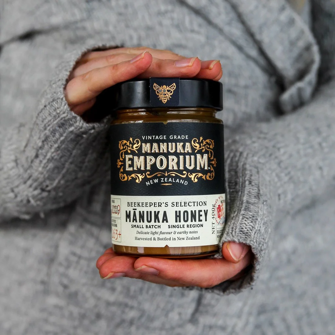
Manuka Emporium
Project Scope:
Naming
Strategy
Packaging Design
Copywriting
Client:
China Hub
Recognition:
World Brand Design UK - Gold
Pentawards UK - Silver
Honey is often mass-produced and blended from multiple sources, resulting in a loss of its true origin and distinctive flavor nuances. Manuka Emporium challenges this norm by partnering exclusively with select New Zealand apiarists to offer pure, single-source honey, carefully inspired by traditional beekeeping methods.
The brand embodies honesty and quality, drawing design cues from vintage liquor labels with elegant copper foiling, distinctive red stamps, and unique bee motifs that stand out. The Beekeepers Selection label thoughtfully highlights important details such as vintage, season, style, flavor notes, and the apiarist's personal signature, presenting each jar of honey as a pure, natural gift meant to be savored and appreciated.
All images courtesy of Onfire Design.


