Talbot Forest
Project Scope:
Packaging Design
Client:
Dairyworks
Recognition:
World Brand Design UK - Gold
Pentawards UK - Silver
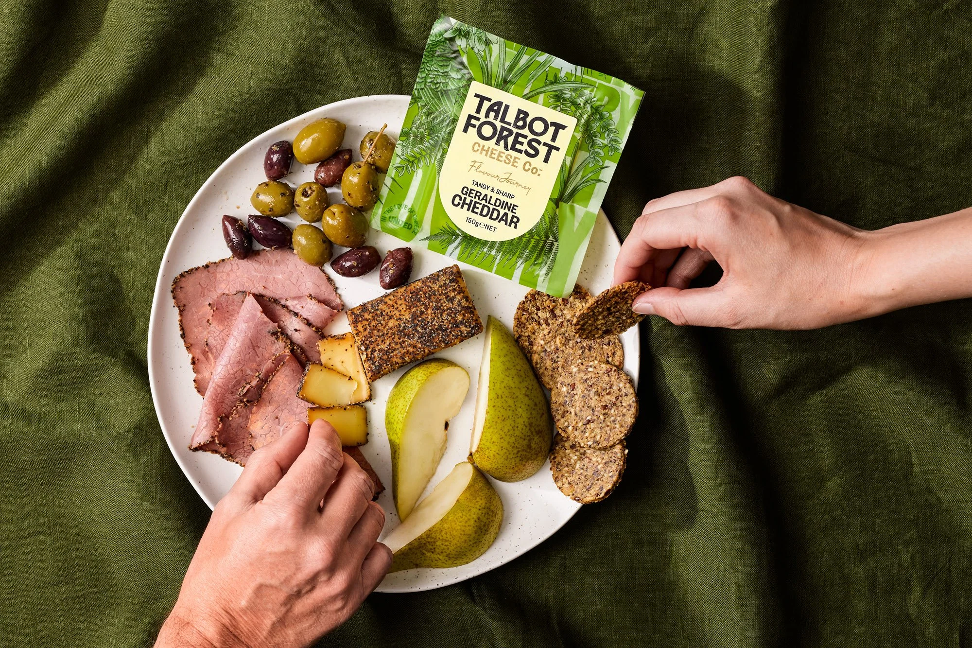
Named after a South Island forest, Talbot Forest Cheese began in 2000 producing specialty cheeses. Growth was fast, but weak branding and lack of marketing expenditure made it a generic manufacturer rather than the bold and iconic Kiwi brand it should be. Tasked with its revival, we drew on its South Island forest roots.
A bold woodblock pattern featuring local flora, fauna, and birds which are found in the area creates dynamic packaging that moves and changes when brand blocked in chillers. The outdated logo was replaced with a large, tree-inspired wordmark. A shield-shaped label, reflecting the motto "United in the love of cheese," uses a pale palette for easy navigation. The refreshed brand stands out with personality and distinctiveness in a crowded market.
All images courtesy of Onfire Design.


